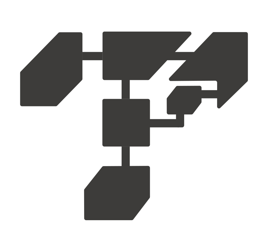
Anchored overlay
The generic anchored layer: a click or hover trigger opens bare content beside it.
Dropdown-, popover-, and tooltip-shaped compositions build on this.
Properties
- Label: the trigger word.
- Trigger: what opens it: click or hover.
- Placement: which side the layer opens on: below, above, left, or right. Collisions flip it.
- Align: where the layer sits along its side: start, center, or end.
- Offset: the gap between the trigger and the layer, in pixels.
- Collision padding: the viewport edge the layer never crosses, in pixels.
- Safe area: the device safe area joins the clamp.